> ## Documentation Index
> Fetch the complete documentation index at: https://docs.msportal.ai/llms.txt
> Use this file to discover all available pages before exploring further.
# Design custom reporting blocks
> Build a reusable reporting block with the AI assistant and explore its charts and datasets
Branch preview: this guide describes the custom-block builder being prepared for release. Screenshots use synthetic sample data in the local builder preview. Availability depends on your tenant's feature access and Reporting permissions.
## Design a block
Use the back arrow beside the page title to return to the **Blocks** tab. Under **Draft history**, the left and right arrows move between your session's drafts.
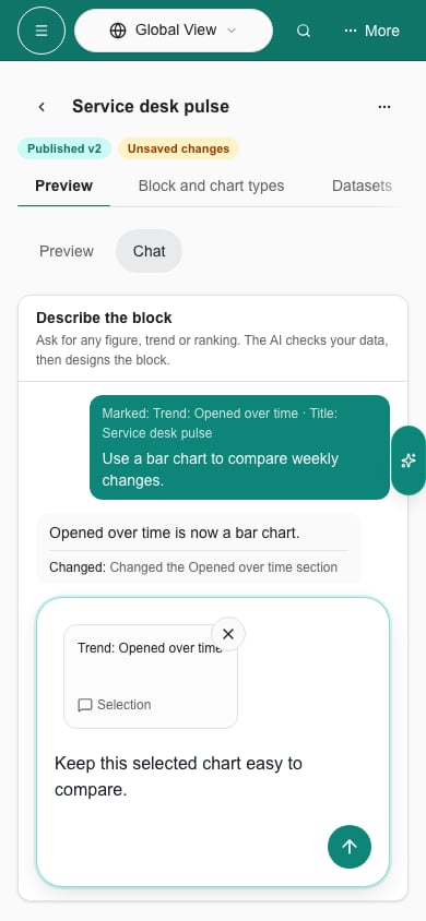
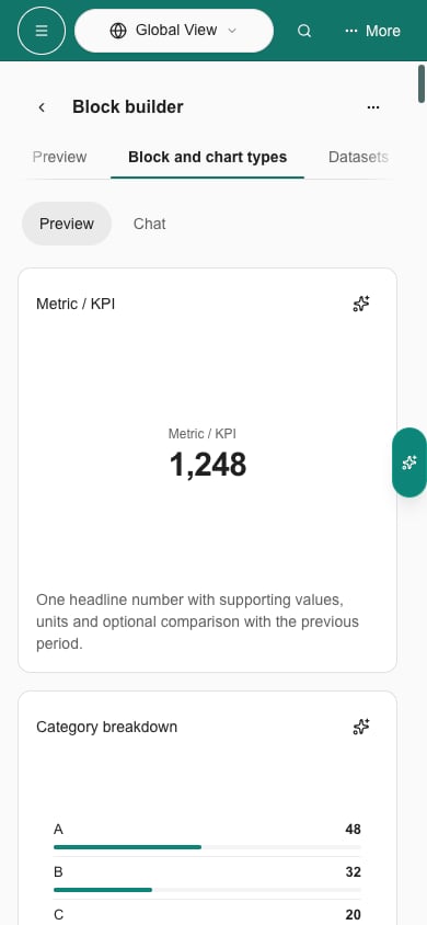
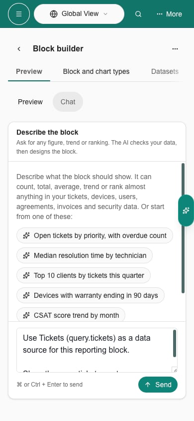
The block designer has its own conversation panel on the right. Choose **Design with AI** to focus its composer. On a phone, switch between **Chat** and **Preview**. Describe the information you want, the period and the chart style. For example:
> A chart of tickets opened per company over the report period.
While the designer works, data lookups and the current step appear below your request. Select **Stop response** to stop the turn. Your conversation and unsent prompt stay available as you browse **Block and chart types** and **Datasets**.
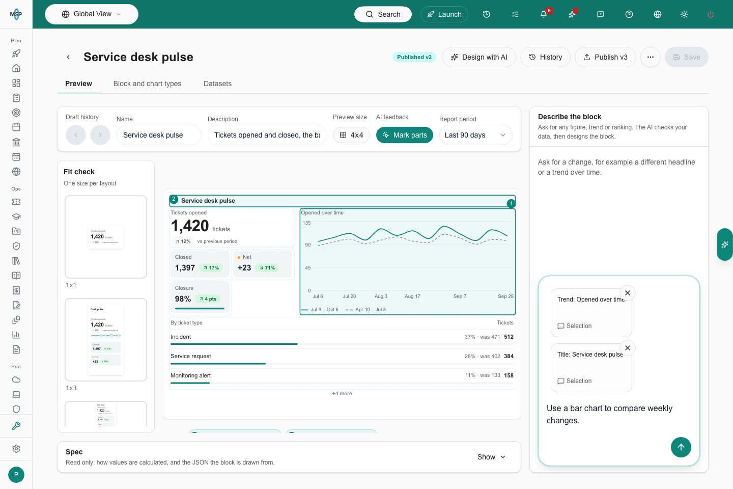
The designer updates the draft preview or asks a follow-up question when it needs more information. One toolbar contains **Draft history**, **Name**, **Description**, **Preview size**, **AI feedback** and **Report period**, with a small label above each control. The toolbar stays on one row; scroll it horizontally on a narrow screen. Select the current **Preview size** to open the complete size grid. Use **Mark parts** to select a specific part of the preview.
**Fit check** is a scrollable rail on the left. Select a thumbnail to preview that size; the rail keeps its position as the main preview changes. On a phone, swipe the thumbnails horizontally. Fit check sits directly beneath the toolbar. Size advice stays at the top left of the main preview area, so showing or hiding a warning does not move the rail or block. On desktop, the advice also stays visible while you scroll the main preview.
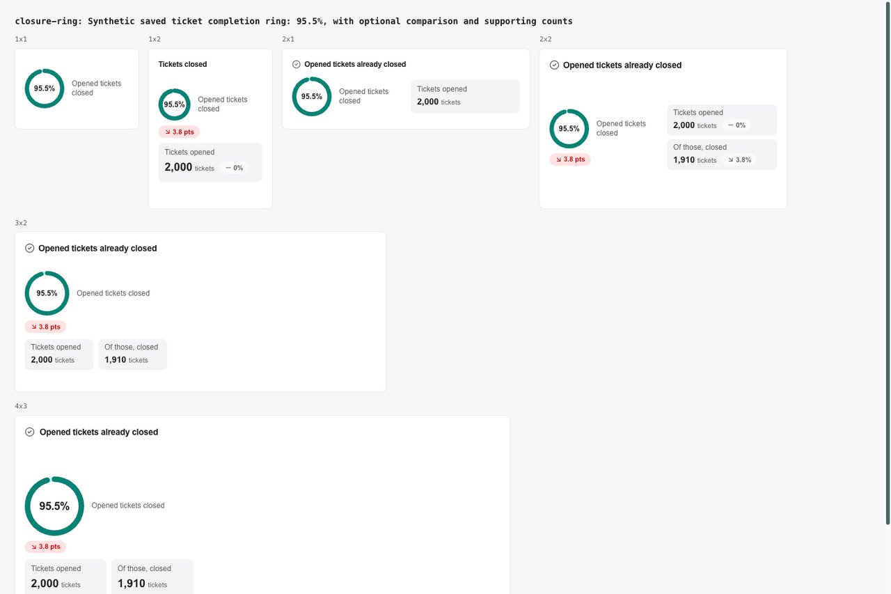
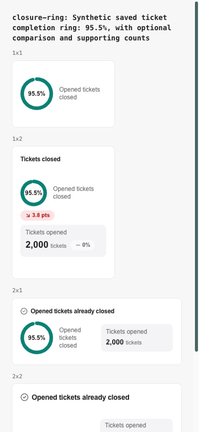
A percentage ring keeps its ring at **1×1**, with the percentage shown once and a short label. Compact previews leave out optional comparison text and explanatory captions. Ask for a previous-period or year-over-year comparison when you want one. To simplify an existing block, ask the designer to remove its comparison, supporting figures or repeated text.
 Use the draft arrows to review or restore an earlier design. Going back from your first generated draft shows **No block yet**; use the right arrow to restore it without generating it again. Enter a name and choose **Save** to save a version. Publishing and managing versions require Manage access to Reporting.
 ## Comment directly on the preview
Choose **Mark parts**, then select a title, value or chart. Choose the small **Ask AI** button beside it to attach that selection to the chat composer. Repeat to attach several parts to the same request.
Write your instruction in the chat, then use the send arrow. You can send immediately or keep selecting more parts before sending. Sent selections leave the composer immediately and remain in the conversation. If the request fails or you stop it, they return for retry. Remove a selection with its **X** without losing your typed instruction. A failed request keeps your selections available to retry. **Stop response** cancels the active response.
Review the resulting preview, then choose **Save**. Feedback updates your draft; it does not publish a block. Enter sends a prompt; Shift+Enter adds a new line.
## Choose a chart or dataset
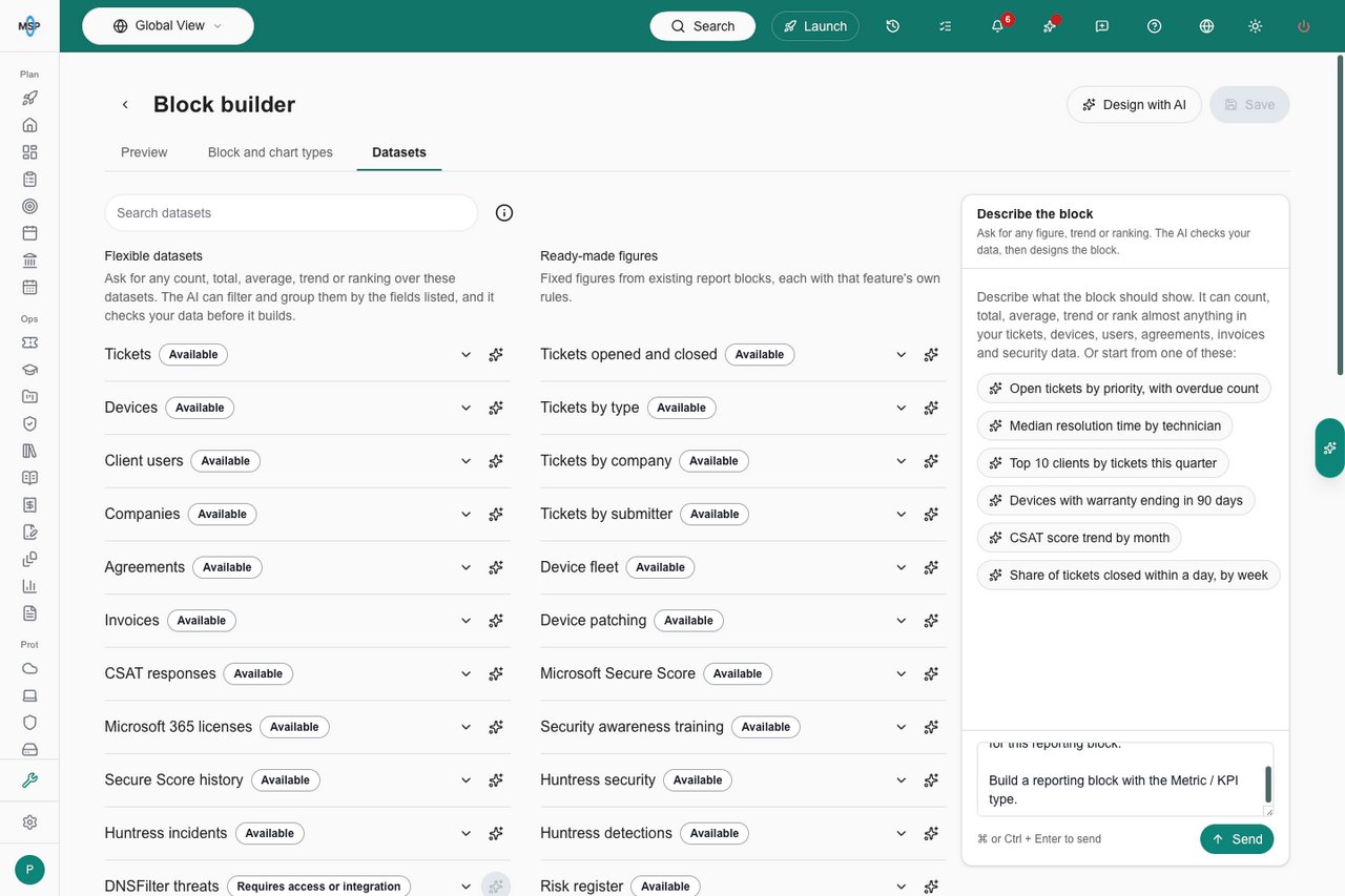
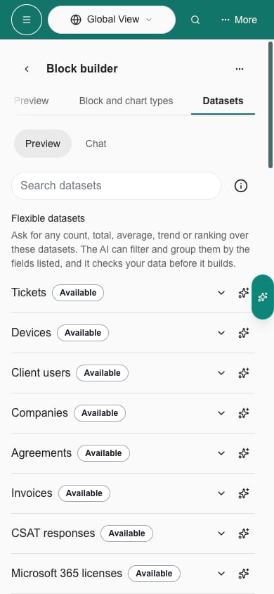
Use the builder's page tabs: **Preview** shows your draft, **Block and chart types** shows a rendered example of each visual option, and **Datasets** lists the data the designer can use. Search for a topic, then expand a dataset to see what it offers. Flexible datasets list their **Fields**, and ready-made figures list their values, breakdowns, time series, tables and supported options. Availability follows your permissions and integrations. See [Flexible datasets](#flexible-datasets) for the full list.
Select the **sparkle button** beside an available dataset to add that exact data source to your prompt. You can choose several datasets and a chart type, and keep writing your own instructions. Selecting the same option again keeps one copy of its instruction. The buttons prefill the composer; send the prompt when it is ready.
The dedicated designer stays beside either guide tab on desktop. Choose **Design with AI** to focus your prompt. On a phone, use **Chat** to continue writing. Switching tabs preserves your draft, dataset search and expanded details.
Select the **info button** beside **Search datasets** to read how data access and company scope work. Staff can compare authorized companies from the tenant view. The company selector filters the preview. Every viewer's company scope and ticket visibility are applied when data loads. Saving or sharing a block does not grant access to another company's records.
## Comment directly on the preview
Choose **Mark parts**, then select a title, value or chart. Choose the small **Ask AI** button beside it to attach that selection to the chat composer. Repeat to attach several parts to the same request.
Write your instruction in the chat, then use the send arrow. You can send immediately or keep selecting more parts before sending. Sent selections leave the composer immediately and remain in the conversation. If the request fails or you stop it, they return for retry. Remove a selection with its **X** without losing your typed instruction. A failed request keeps your selections available to retry. **Stop response** cancels the active response.
Review the resulting preview, then choose **Save**. Feedback updates your draft; it does not publish a block. Enter sends a prompt; Shift+Enter adds a new line.
## Choose a chart or dataset
Use the builder's page tabs: **Preview** shows your draft, **Block and chart types** shows a rendered example of each visual option, and **Datasets** lists the data the designer can use. Search for a topic, then expand a dataset to see what it offers. Flexible datasets list their **Fields**, and ready-made figures list their values, breakdowns, time series, tables and supported options. Availability follows your permissions and integrations. See [Flexible datasets](#flexible-datasets) for the full list.
Select the **sparkle button** beside an available dataset to add that exact data source to your prompt. You can choose several datasets and a chart type, and keep writing your own instructions. Selecting the same option again keeps one copy of its instruction. The buttons prefill the composer; send the prompt when it is ready.
The dedicated designer stays beside either guide tab on desktop. Choose **Design with AI** to focus your prompt. On a phone, use **Chat** to continue writing. Switching tabs preserves your draft, dataset search and expanded details.
Select the **info button** beside **Search datasets** to read how data access and company scope work. Staff can compare authorized companies from the tenant view. The company selector filters the preview. Every viewer's company scope and ticket visibility are applied when data loads. Saving or sharing a block does not grant access to another company's records.

 Change indicators show the arrow and amount without repeating “vs previous period” on each block. A comparison with the same period last year still names that different baseline. Existing blocks use this display automatically; no AI regeneration is needed.
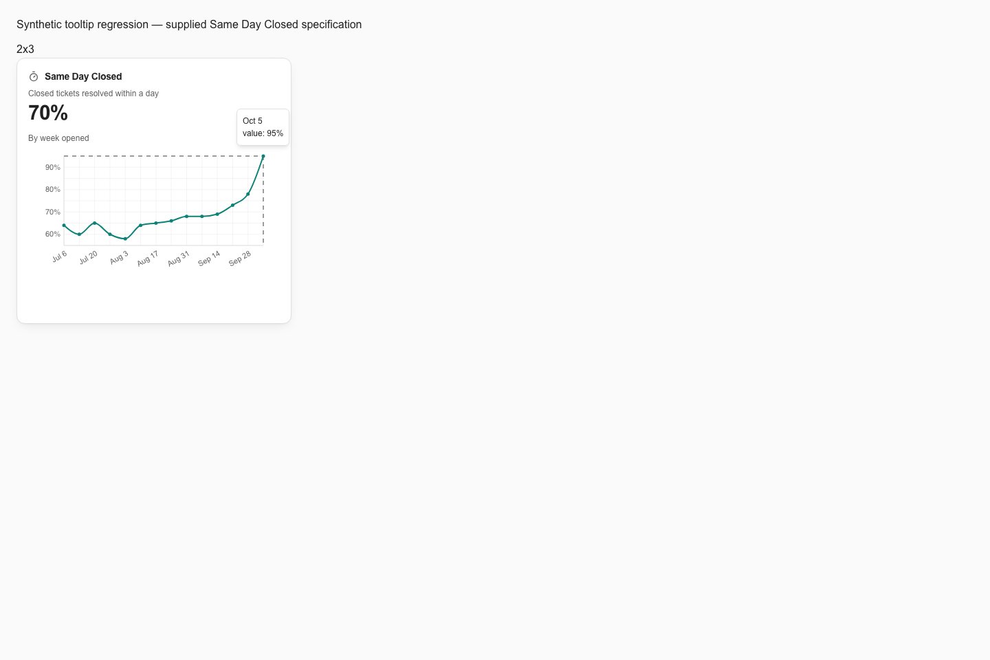
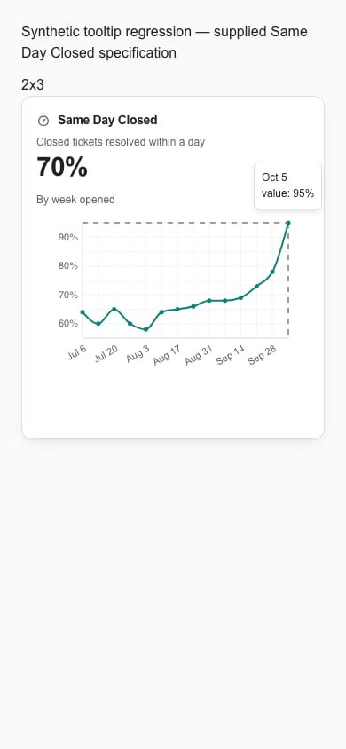
Hover over a point in a custom line or area chart to read its date and value. In this branch preview, line, area, bar, scatter and heatmap tooltips stay visible above the card content and fit within the screen. Tooltips are hidden in print.
Change indicators show the arrow and amount without repeating “vs previous period” on each block. A comparison with the same period last year still names that different baseline. Existing blocks use this display automatically; no AI regeneration is needed.
Hover over a point in a custom line or area chart to read its date and value. In this branch preview, line, area, bar, scatter and heatmap tooltips stay visible above the card content and fit within the screen. Tooltips are hidden in print.
 ### What a block can ask of the data
Besides totals and trends, a block built on a flexible dataset can do the following. Describe the result you want in your own words. The assistant works out the rest.
* **List individual records.** Ask for records instead of totals. A list holds up to 50 records. A table block shows up to four columns of it, and a small block shows fewer rows and columns. For example: "List the ten oldest open tickets with their number, company and age."
* **Group by weekday or hour of the day.** Use this to see when things happen. Weekdays start on Monday and hours run from 0 to 23, in your MSP's time zone. Hours work only on dates that include a time of day, not on calendar dates such as a warranty end date. For example: "Show when tickets arrive, by hour of the day, over the last 90 days."
* **Group a number into bands.** Cut a number such as ticket age into ranges. For example: "Show open tickets by age: under 1 day, 1 to 3 days, 3 to 7 days and 7 days or more."
* **Compare with the same period last year.** The block shows the change against the same dates one year earlier, instead of the previous period of the same length. Ask for this only when you want a year-over-year view. It applies to figures that follow the report period, so a figure that shows the current state has nothing to compare. For example: "Show tickets opened this period and how that compares with the same period last year."
* **Show a ratio for each client.** Divide one figure by another for every company, even when the two figures come from different datasets. Both figures must be grouped by the same field, such as company, and a block can hold up to four such ratios. For example: "Show tickets per user for each company this quarter." Or: "Show tickets per device by company."
* **Benchmark a client against your other clients.** The Ticket benchmarks dataset compares each client's tickets per endpoint per month, by reason, with the same rate across all your clients. Each reason shows the client's rate, the top-quartile rate and the median rate. A red, yellow or green dot shows where the client stands. For example: "For this client, show tickets per endpoint by ticket type against our top-quartile benchmark, with red, yellow and green." See [Ticket benchmarks](#ticket-benchmarks) for how the figures are calculated.
* **Compare hardware age with best practice.** Devices are classed as Computer, Server, Printer, Network or Other, and each class has a best-practice replacement age. For example: "Show average device age by class against the best-practice replacement age, and how many devices are past it."
## Block and chart types
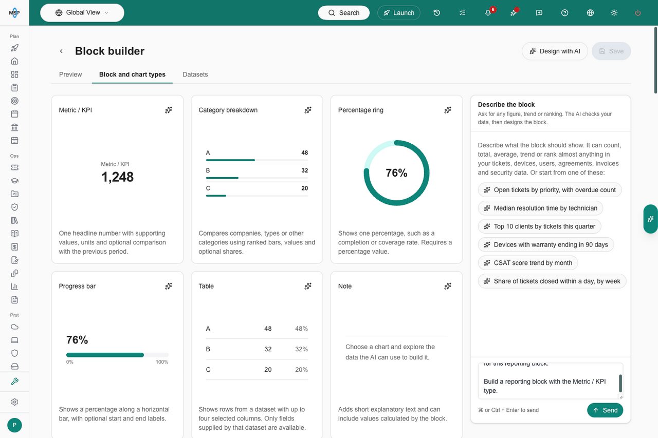
Browse one gallery of block and chart types, with one preview per type. Select the **sparkle button** at the top right of any card to open the composer with a starter such as “Build a reporting block with the Bar chart type.” Its tooltip and accessible label say **Add \[type] to prompt**. Any text already in your prompt is kept. Add the measures, companies and period you want, then send the prompt when it is ready.
| Type | Use it for |
| - | - |
| Metric / KPI | One headline number with supporting values, units and optional comparison with the previous period or the same period last year. |
| Line chart | Shows how a value changes over time. Requires a time series, such as tickets opened per week. |
| Area chart | A filled time-series chart that emphasizes volume over the period. |
| Bar chart | Compares categories or time buckets with real bars and numeric axes. Ask for horizontal bars for long company names, or grouped or stacked bars for multiple measures. Line, area and bar charts can also split one measure by a second field, such as tickets per month stacked by priority. |
| Category breakdown | Compares companies, types or other categories using ranked bars, values and optional shares. |
| Donut / pie chart | Shows how categories contribute to a total. A pie is a full circle; a donut has a hole in the center. Ask for the presentation you want. |
| Percentage ring | Shows one percentage inside a ring, including at 1×1. Requires a percentage value. |
| Progress bar | Shows a percentage along a horizontal bar, with optional start and end labels. |
| Table | Shows rows from a dataset with up to four selected columns. Can list individual records, such as the ten oldest open tickets. Only fields supplied by that dataset are available. |
| Timeline | Shows one bar per project or roadmap item, from its start date to its end date, with an optional color by status and a **Today** line. |
| Note | Adds short explanatory text and can include values calculated by the block. |
## Use the full chart libraries
Name the chart you want and the measures it should show, or select the **sparkle button** from its preview. For example:
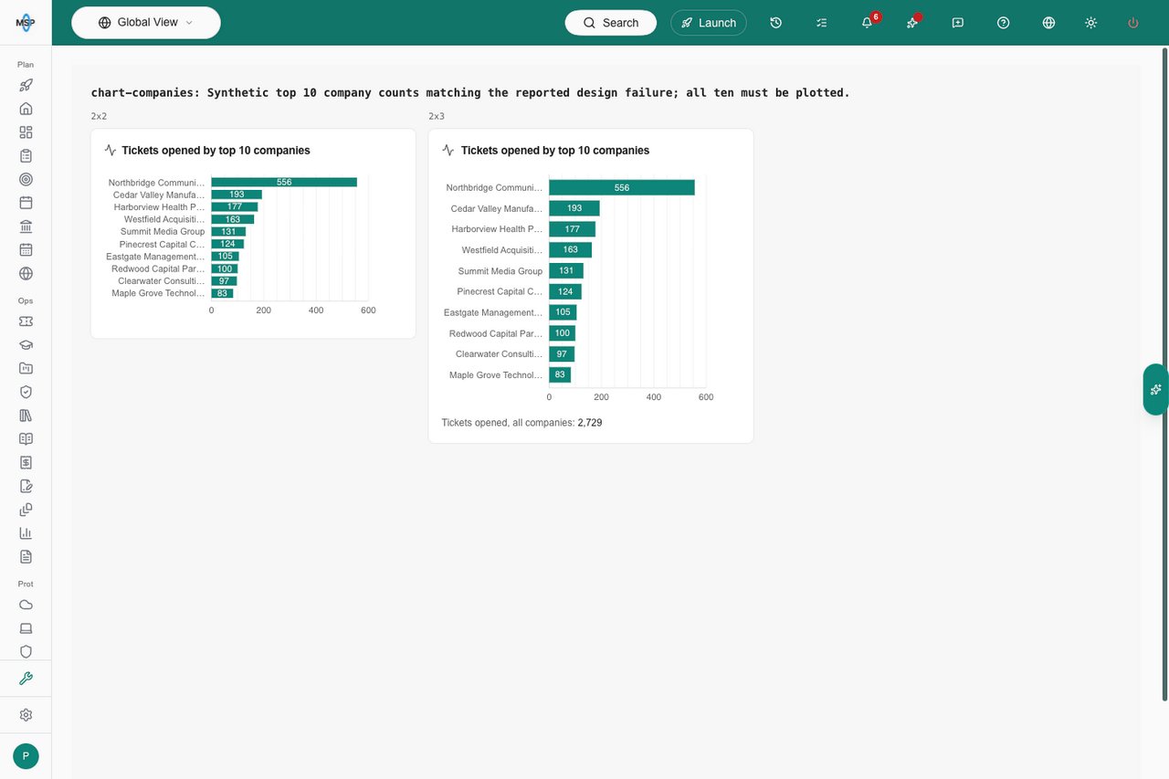
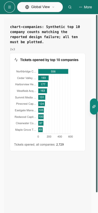
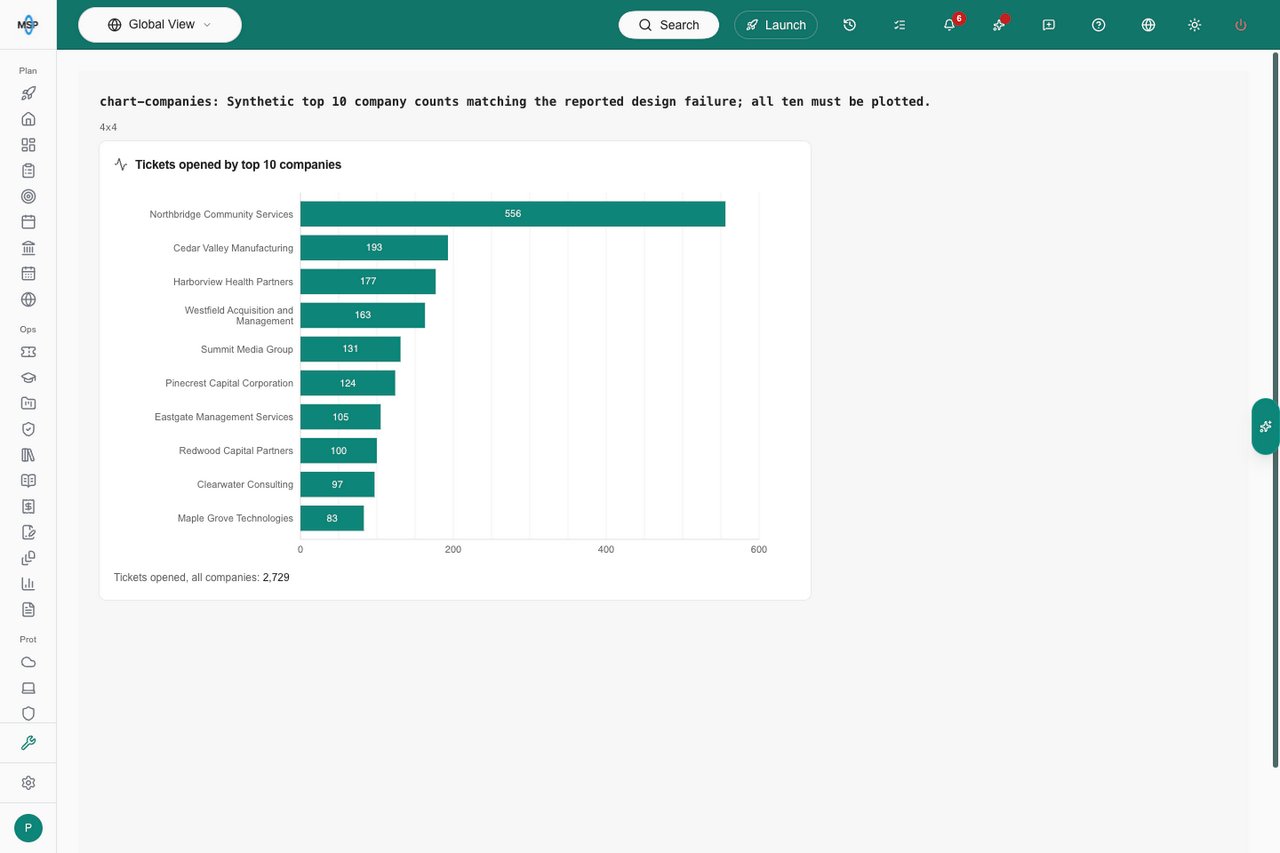
> Create a horizontal bar chart showing tickets opened by the 10 companies with the most tickets this quarter. Show all 10 in a normal block.
The chart uses the main area of the block. All selected companies stay in the plot; resizing changes the available drawing space, not the selected top 10. Small previews shorten long labels. Changing the default placement size is separate from fixing the design. The report or dashboard period supplies “this quarter.” If “largest companies” means something other than ticket volume, tell the assistant the size measure to use.
The gallery includes bar, line, area, pie, donut, scatter, radar, radial bar, funnel, treemap, Sankey, composed, area bump, bump, box plot, bullet, calendar heatmap, time range, chord, circle packing, choropleth, geographic map, heatmap, icicle, Marimekko, network, parallel coordinates, polar bar, stream, sunburst, swarm plot, timeline, tree, Voronoi and waffle charts. Scatter plots can use bubble sizes; composed charts combine bars, lines and areas. The assistant selects a suitable renderer automatically.
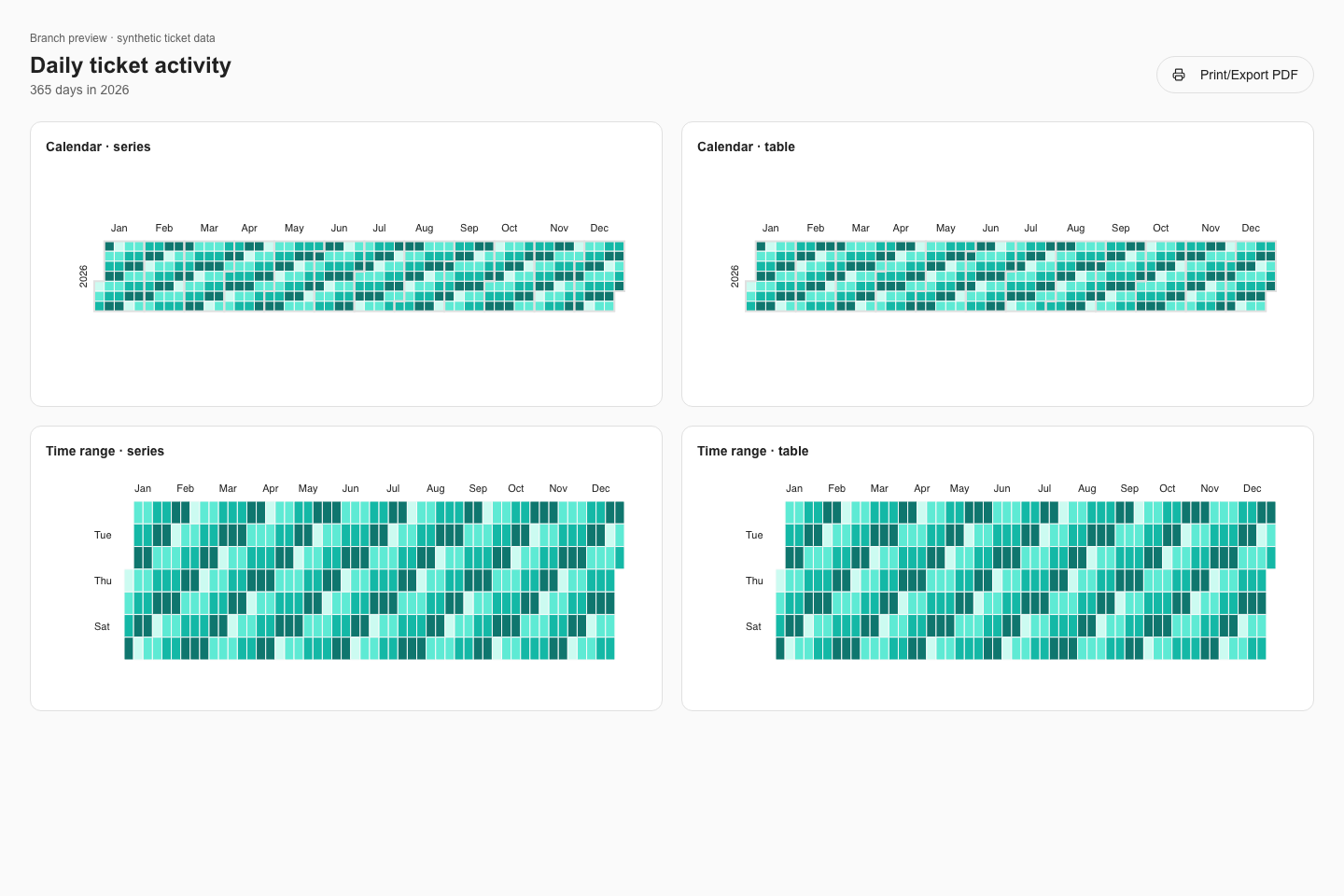
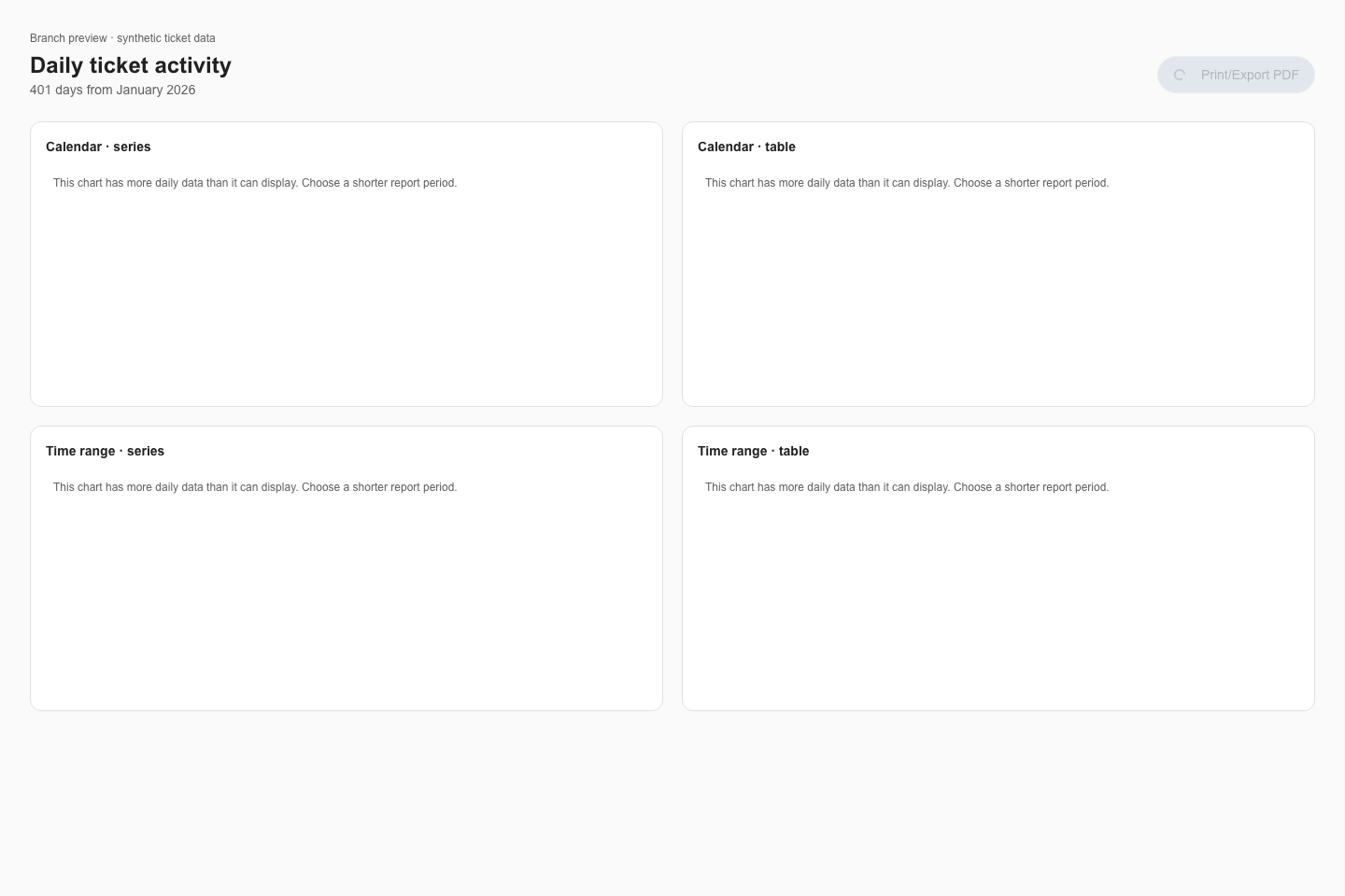
Some charts need additional evidence: scatter plots need numeric X and Y columns, flow charts need actual source and target relationships, box plots and swarm plots need several observations in each group, maps need country names or codes, and a timeline needs a start date for each record. Calendar and time-range charts need daily values. Use a query grouped by day, or built-in ticket counts, which request daily values for these charts even when the report period is longer than 31 days. Each dataset is limited to 400 daily points. If the source or a chart limit leaves out days, the chart asks you to choose a shorter report period. Print and PDF stay unavailable until the chart can show the complete daily data. Weekly or monthly totals cannot be plotted as daily activity. Bullet charts need a target, which you can state in your request. The assistant validates the chart against the fields you can access and asks for missing information rather than inventing it. Choosing a chart does not grant access to additional tenant data.
### What a block can ask of the data
Besides totals and trends, a block built on a flexible dataset can do the following. Describe the result you want in your own words. The assistant works out the rest.
* **List individual records.** Ask for records instead of totals. A list holds up to 50 records. A table block shows up to four columns of it, and a small block shows fewer rows and columns. For example: "List the ten oldest open tickets with their number, company and age."
* **Group by weekday or hour of the day.** Use this to see when things happen. Weekdays start on Monday and hours run from 0 to 23, in your MSP's time zone. Hours work only on dates that include a time of day, not on calendar dates such as a warranty end date. For example: "Show when tickets arrive, by hour of the day, over the last 90 days."
* **Group a number into bands.** Cut a number such as ticket age into ranges. For example: "Show open tickets by age: under 1 day, 1 to 3 days, 3 to 7 days and 7 days or more."
* **Compare with the same period last year.** The block shows the change against the same dates one year earlier, instead of the previous period of the same length. Ask for this only when you want a year-over-year view. It applies to figures that follow the report period, so a figure that shows the current state has nothing to compare. For example: "Show tickets opened this period and how that compares with the same period last year."
* **Show a ratio for each client.** Divide one figure by another for every company, even when the two figures come from different datasets. Both figures must be grouped by the same field, such as company, and a block can hold up to four such ratios. For example: "Show tickets per user for each company this quarter." Or: "Show tickets per device by company."
* **Benchmark a client against your other clients.** The Ticket benchmarks dataset compares each client's tickets per endpoint per month, by reason, with the same rate across all your clients. Each reason shows the client's rate, the top-quartile rate and the median rate. A red, yellow or green dot shows where the client stands. For example: "For this client, show tickets per endpoint by ticket type against our top-quartile benchmark, with red, yellow and green." See [Ticket benchmarks](#ticket-benchmarks) for how the figures are calculated.
* **Compare hardware age with best practice.** Devices are classed as Computer, Server, Printer, Network or Other, and each class has a best-practice replacement age. For example: "Show average device age by class against the best-practice replacement age, and how many devices are past it."
## Block and chart types
Browse one gallery of block and chart types, with one preview per type. Select the **sparkle button** at the top right of any card to open the composer with a starter such as “Build a reporting block with the Bar chart type.” Its tooltip and accessible label say **Add \[type] to prompt**. Any text already in your prompt is kept. Add the measures, companies and period you want, then send the prompt when it is ready.
| Type | Use it for |
| - | - |
| Metric / KPI | One headline number with supporting values, units and optional comparison with the previous period or the same period last year. |
| Line chart | Shows how a value changes over time. Requires a time series, such as tickets opened per week. |
| Area chart | A filled time-series chart that emphasizes volume over the period. |
| Bar chart | Compares categories or time buckets with real bars and numeric axes. Ask for horizontal bars for long company names, or grouped or stacked bars for multiple measures. Line, area and bar charts can also split one measure by a second field, such as tickets per month stacked by priority. |
| Category breakdown | Compares companies, types or other categories using ranked bars, values and optional shares. |
| Donut / pie chart | Shows how categories contribute to a total. A pie is a full circle; a donut has a hole in the center. Ask for the presentation you want. |
| Percentage ring | Shows one percentage inside a ring, including at 1×1. Requires a percentage value. |
| Progress bar | Shows a percentage along a horizontal bar, with optional start and end labels. |
| Table | Shows rows from a dataset with up to four selected columns. Can list individual records, such as the ten oldest open tickets. Only fields supplied by that dataset are available. |
| Timeline | Shows one bar per project or roadmap item, from its start date to its end date, with an optional color by status and a **Today** line. |
| Note | Adds short explanatory text and can include values calculated by the block. |
## Use the full chart libraries
Name the chart you want and the measures it should show, or select the **sparkle button** from its preview. For example:
> Create a horizontal bar chart showing tickets opened by the 10 companies with the most tickets this quarter. Show all 10 in a normal block.
The chart uses the main area of the block. All selected companies stay in the plot; resizing changes the available drawing space, not the selected top 10. Small previews shorten long labels. Changing the default placement size is separate from fixing the design. The report or dashboard period supplies “this quarter.” If “largest companies” means something other than ticket volume, tell the assistant the size measure to use.
The gallery includes bar, line, area, pie, donut, scatter, radar, radial bar, funnel, treemap, Sankey, composed, area bump, bump, box plot, bullet, calendar heatmap, time range, chord, circle packing, choropleth, geographic map, heatmap, icicle, Marimekko, network, parallel coordinates, polar bar, stream, sunburst, swarm plot, timeline, tree, Voronoi and waffle charts. Scatter plots can use bubble sizes; composed charts combine bars, lines and areas. The assistant selects a suitable renderer automatically.
Some charts need additional evidence: scatter plots need numeric X and Y columns, flow charts need actual source and target relationships, box plots and swarm plots need several observations in each group, maps need country names or codes, and a timeline needs a start date for each record. Calendar and time-range charts need daily values. Use a query grouped by day, or built-in ticket counts, which request daily values for these charts even when the report period is longer than 31 days. Each dataset is limited to 400 daily points. If the source or a chart limit leaves out days, the chart asks you to choose a shorter report period. Print and PDF stay unavailable until the chart can show the complete daily data. Weekly or monthly totals cannot be plotted as daily activity. Bullet charts need a target, which you can state in your request. The assistant validates the chart against the fields you can access and asks for missing information rather than inventing it. Choosing a chart does not grant access to additional tenant data.
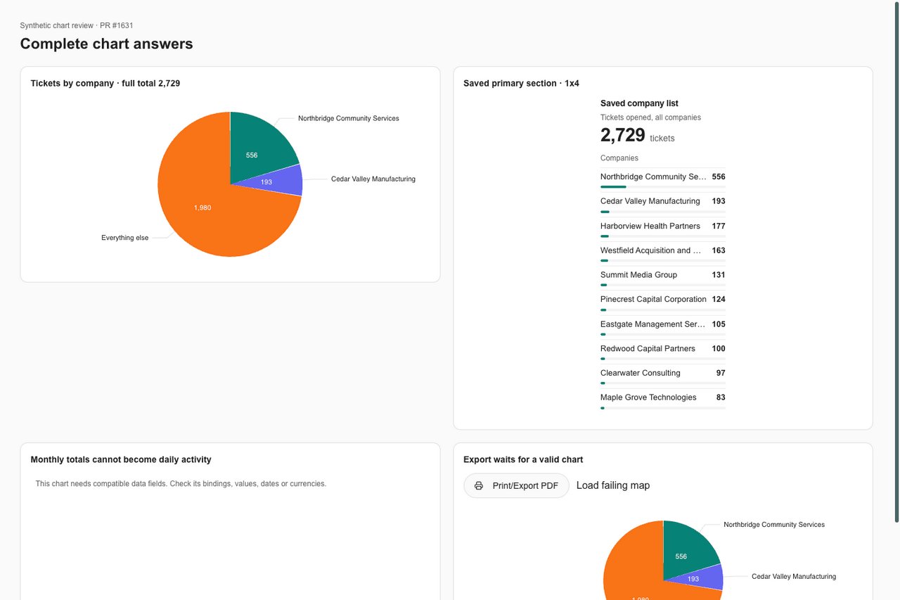
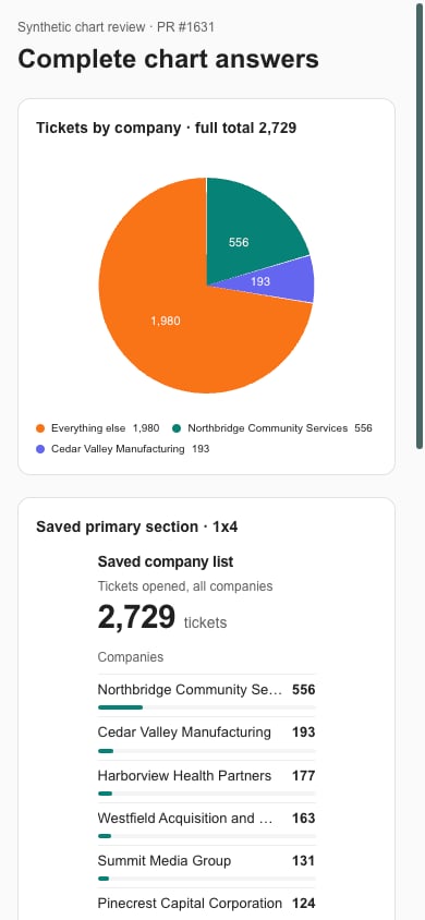
 In the branch preview, pie, donut, waffle and proportional hierarchy charts keep a known omitted share as **Everything else**, including categories outside a selected top N. An omitted share stays separate from named groups even when a group is also called **Everything else**. If an incomplete table does not provide the missing values, the chart shows an invalid-data message instead of inventing a whole. Narrow pies and donuts use a compact legend so category names remain readable. A saved layout that chooses a list keeps that list visible in tall single-column blocks.
 In the branch preview, shortened chart axis labels retain the full company or category name. Hover over the label, or focus it with Tab, to read it. The same behavior applies to [shortened dashboard text](/user-guides/dashboards/read-a-dashboard#read-shortened-labels).
 ### Split a chart by a second field
A bar, line, area, heatmap, stream, radar or polar bar chart can split one measure by a second field. The chart then draws one stacked or grouped series for each value of that field. Ask for one measure at a time. For example:
> Show tickets opened per month for the last six months, stacked by priority.
A chart shows up to 8 series, or 24 columns on a heatmap. When a count or total has more groups than that, the smallest groups are combined into **Everything else**, so the figures still add up. Averages, medians and similar figures do not add up, so only the largest groups are kept. Groups with a natural order, such as weekdays, hours, bands or dates, are never combined or reordered. If there are too many of them to fit, the chart does not draw and says its data is not compatible.
### Show projects and roadmap items on a timeline
A timeline draws one bar for each record, from a start date to an end date. Use it for projects and planner (technology roadmap) items. Both datasets are for MSP staff only. For example:
> Show open projects on a timeline from start date to due date, colored by status.
Bars are ordered by start date, and you can color them by a text field such as status. A **Today** line appears when today falls inside the dates shown. A record with no start date is left out, and a record with no end date appears as a single marker at its start. A timeline shows the first 40 records unless you ask for a different number, up to 50. A small block draws only as many bars as fit.
### More chart options
* **A total line over split lines.** A line, bar or area chart split by a second field can add a **Total** series that adds up every group. For example: "Trend tickets by type each month as a line per type, plus a total line."
* **Status dots in tables.** A number column in a table can show a red, yellow or green dot from limits you state. For example: "Mark the percentile column green at 75 or more, yellow from 50 and red below 50."
* **Bump and area bump charts over time.** Ask for a ranking by month, week or another period. A bump chart ranks the groups at each period for you, with the largest as rank 1. An area bump chart sizes each group by its volume instead of ranking it. Both keep the top 10 groups. For example: "Show a bump chart of the top 5 boards by tickets opened each month."
* **Bullet charts with a target.** State the target number in your request and the chart marks it. The range behind the bar is optional. For example: "Show average CSAT score by technician as a bullet chart with a target of 90."
* **Box plots and swarm plots.** These draw how values spread across the groups of a second grouping or across listed records. For example: "Show a box plot of daily ticket counts for each board over the last 90 days." Or: "Show a swarm plot of resolution hours for the 50 most recently closed tickets, grouped by priority."
* **World maps.** Country names, two-letter codes and three-letter codes all work, so "United States", "US" and "USA" count as the same country. Rows with the same country are added together, and rows that match no country are left out. For example: "Show how many client companies we have in each country on a world map."
### Numbers and dates on charts
Chart numbers show their unit. Money shows with its currency, and percentages, hours, days and file sizes show with their own unit. Dates on an axis are written for people, so a monthly axis reads "Sep 2026" rather than "2026-09-01". Amounts in different currencies are never added together.
## Flexible datasets
Flexible datasets are tables of records that the assistant can count, total, average, group, filter and list. Describe what you want and the assistant chooses the dataset, checks your data and builds the block. To see every field in a dataset, open the **Datasets** tab in the builder, find the dataset under **Flexible datasets** and expand it to read its **Fields**. This guide does not repeat those lists.
Each dataset needs the matching permission, so it shows as **Available** only when your role allows that area. A dataset that reads from an integration also needs that integration connected. Otherwise it shows **Requires access or integration**. Datasets marked MSP staff only never load for client users, so a client cannot open a block built on them. A few individual fields, such as hours on tickets, estimated revenue on agreements and the backup vendor, are also for MSP staff only, even in datasets that clients can use.
| Dataset | One row is | Who can use it | Needs besides the permission |
| - | - | - | - |
| Tickets | One ticket | Everyone with the permission | Nothing extra |
| Ticket SLA | One ticket, with its first response and SLA results | Everyone with the permission | Nothing extra. Response data comes from ConnectWise, Halo or Autotask |
| Ticket benchmarks | One client, ticket field and reason, with its tickets per endpoint and the rates across all your clients | Everyone with the tickets and devices permissions who can see every ticket | Nothing extra |
| Time entries | One time entry logged against a ticket | MSP staff only | ConnectWise, Halo or Autotask |
| Devices | One device | Everyone with the permission | Nothing extra |
| Installed software | One software version at one company | MSP staff only | Nothing extra |
| Backup status | One protected item, such as a device, mailbox or workload | Everyone with the permission | Any one of Cove, Acronis, NinjaOne Backup, Slide, Datto BCDR, NinjaOne SaaS Backup, Spanning or Kaseya SaaS Protection |
| Vulnerabilities | One vulnerability found on one endpoint | MSP staff only | Cork |
| Client users | One person at a client company | Everyone with the permission | Nothing extra |
| Companies | One client company | Everyone with the permission | Nothing extra |
| Agreements | One service agreement | Everyone with the permission | Nothing extra |
| Invoices | One invoice | Everyone with the permission | Nothing extra |
| CSAT responses | One survey response | Everyone with the permission | Nothing extra |
| Microsoft 365 licenses | One license type at one company | Everyone with the permission | Microsoft 365 |
| M365 license history | One license type at one company on one snapshot date | Everyone with the permission | Microsoft 365 |
| M365 user licenses | One license assigned to one person | Everyone with the permission | Microsoft 365 |
| M365 MFA status | One person in one client's Microsoft 365, with their MFA status | MSP staff only | CIPP |
| Secure Score history | One company's Secure Score on one day | Everyone with the permission | Microsoft 365 |
| Huntress incidents | One incident report | Everyone with the permission | Huntress |
| DNSFilter threats | One threat event | Everyone with the permission | DNSFilter |
| Email threats | One email security event | Everyone with the permission | Avanan |
| Awareness training users | One enrolled person on one training platform | MSP staff only | Any one of Breach Secure Now, Phin, Huntress, CyberHoot or Phished.io |
| Phishing results | One simulated phishing email and what the recipient did | MSP staff only | Huntress |
| Compliance checks | One compliance check for one company | MSP staff only | Nothing extra |
| Risk register | One risk for one company | MSP staff only | Risk tracking turned on for your organization |
| Sales opportunities | One sales opportunity | MSP staff only | ConnectWise, Autotask or Halo |
| Sales quotes | One sales quote | MSP staff only | Any one of Quoter, QuoteWerks, Salesbuildr, ConnectWise, Autotask or Halo |
| Cloud subscriptions | One Pax8 or Sherweb subscription | MSP staff only | Pax8 or Sherweb |
| Budget line items | One line of a client IT budget | Everyone with the permission | Nothing extra |
| Projects | One project | MSP staff only | Nothing extra |
| Planner items | One planner (technology roadmap) item | MSP staff only | Nothing extra |
| Onboarding tasks | One task of a client onboarding | MSP staff only | Nothing extra |
| Client meetings | One meeting with a client | MSP staff only | Nothing extra |
| Client goals | One goal for a client company | MSP staff only | Nothing extra |
| Client domains | One domain for one client company | Everyone with the permission | Nothing extra |
| Documentation assets | One documented asset or configuration | MSP staff only | Hudu or IT Glue |
Several datasets gained fields you can list, filter or group by. Examples are ticket number, device name, serial number, device age in years, device class and its best-practice replacement age, memory and CPU cores where Datto RMM reports them, CSAT comment text, project name and estimated revenue, planner item title and type, and the end-of-life date of installed software. Name, title, number and comment fields can be listed and searched, but not used to group results.
### Ticket benchmarks
The Ticket benchmarks dataset shows how one client's ticket load compares with your other clients over the same report period.
* **Rate:** tickets opened in the period per endpoint per month. Lower is better.
* **Endpoints:** the client's active computers and servers today. Printers and network devices do not count.
* **Who is compared:** active clients with at least 5 endpoints. Clients with fewer have no benchmark rows.
* **Reasons:** ticket type, issue type, sub-issue type, category or priority, or all tickets together.
* **Top quartile:** the rate that the best quarter of your clients are at or below.
* **Percentile:** the share of your other clients with a higher rate. 75 or more is top quartile, and below 50 is worse than the median.
* **Privacy:** viewers see only the rates across all clients, never another client's name or figures. The benchmark figures stay empty until at least 5 clients qualify.
* **Access:** a viewer must be able to see every ticket on every board, because the rates count all of them. Ticket types your organization hides are left out for every client.
Best-practice replacement ages used for device classes are 4 years for computers and 5 years for servers, network devices and printers. Device age comes from the warranty start date, so devices without one have no age.
## Dataset reference
These are the ready-made figures currently supported by the custom-block designer. The **Datasets** tab lists them under **Ready-made figures** and shows whether each is available to you.
### Tickets opened and closed
Tickets opened and closed in the report period, bucketed by day (periods up to 31 days), week (up to 180 days) or month. Calendar and time-range charts request daily buckets within the 400-point dataset limit. Recurring tickets the tenant excludes from dashboards are left out.
**Values**
* Tickets opened in the period
* Tickets closed in the period
* Opened minus closed: how much the backlog grew (positive) or shrank (negative)
* Tickets closed as a percentage of tickets opened; empty when nothing was opened
**Time series**
* Tickets opened per bucket
* Tickets closed per bucket
* Opened minus closed per bucket
**Tables and columns**
* One row per bucket, oldest first
Columns: Start of the bucket; shown as the day, week or month it covers; Tickets opened in the bucket; Tickets closed in the bucket; Opened minus closed in the bucket.
### Tickets by type
Tickets created in the report period, split by PSA ticket type (optionally type and subtype). Types the tenant excludes from dashboards are left out.
**Options**
* Include Subtypes: true or false. Default: false.
**Values**
* Tickets created in the period
**Category breakdowns**
* Tickets per type, largest first
### Tickets by company
Tickets opened in the report period, grouped by client company. Use for charts comparing companies across the tenant. Returns the busiest 200 companies and the exact total across all authorized companies. Respects company scope, ticket visibility, board restrictions, excluded ticket types and recurring-ticket settings. Only tickets linked to a company are included.
**Values**
* Tickets opened across all authorized companies in the period, including companies beyond the top 200
* Authorized companies with tickets opened in the period
**Category breakdowns**
* Tickets opened per company, busiest first (top 200); total includes every authorized company
### Tickets by submitter
Tickets created in the report period, split by the person who submitted them (top submitters only, up to the limit param).
**Options**
* Limit: 5 to 100. Default: 10.
**Values**
* Tickets created in the period by every submitter. Unknown (null) when more submitters exist than are loaded; do not divide by it, use the breakdown for shares
**Category breakdowns**
* Tickets per submitter, busiest first
### Device fleet
Current device inventory across every connected RMM and PSA: status counts, stale devices, warranty position, a 0-100 health score, and splits by OS, type, manufacturer, source, status and location.
**Options**
* Stale Days: 7, 14, 30, 60, 90. Default: 30.
* Warranty Expiring Days: 30, 60, 90, 180. Default: 90.
**Values**
* Devices in inventory
* Devices with an active status
* Devices with an inactive status
* Devices in maintenance
* Retired devices
* Devices not seen for more than the staleDays param
* Devices whose warranty ends within the warrantyExpiringDays param
* Devices out of warranty
* Devices with no warranty end date recorded
* Fleet health score from 0 to 100
**Category breakdowns**
* Devices per operating system
* Devices per device type
* Devices per manufacturer
* Devices per integration that reports them
* Devices per status
* Devices per location
### Device patching
Current RMM patch status: devices fully patched, pending, awaiting reboot, failed or without a patch policy, patch coverage, and the devices that need attention.
**Values**
* Devices reporting patch status
* Fully patched devices
* Devices with patches pending
* Devices waiting for a reboot to finish patching
* Devices with failed patches
* Devices with no patch policy
* Devices with an unknown patch status
* Patched devices as a percentage of devices reporting
* Individual patches pending across all devices
* Individual patches not yet approved
* Individual patches installed
**Category breakdowns**
* Devices reporting patch status per device type
* Devices per patch status
**Tables and columns**
* Devices that need patch attention, worst first
Columns: Device name; Patch status; Client company; Patches pending on the device; When the RMM last saw the device.
### Microsoft Secure Score
Latest Microsoft Secure Score: points achieved out of the maximum, the percentage, the industry average, licensed and active users, and the score per control category.
**Values**
* Secure Score points achieved
* Secure Score points available
* Points achieved as a percentage of points available
* Average Secure Score across all Microsoft tenants
* Points above (positive) or below the industry average
* Licensed Microsoft 365 users
* Active Microsoft 365 users
**Category breakdowns**
* Percentage of available points achieved per control category
### Security awareness training
Security awareness training enrollments: enrolled, completed, in progress and not started, the completion rate, monthly enrollments and completions over the last monthsToShow months, and the top courses. Uses its own month window, not the report period.
**Options**
* Months To Show: 3, 6, 12, 24. Default: 6.
**Values**
* Course enrollments
* Completed enrollments
* Enrollments in progress
* Enrollments not started
* Completed enrollments as a percentage of all enrollments
**Time series**
* Enrollments per month
* Completions per month
**Tables and columns**
* Courses with the most enrollments (top 5)
Columns: Course title; Enrollments in the course; Completions of the course; Completion rate for the course.
### Huntress security
Current Huntress position: agents installed and active, incidents and escalations (total and still open), and remediations (total and pending). Counts are as of now, not for the report period.
**Values**
* Huntress agents installed
* Huntress agents reporting in
* Incident reports, all time
* Incident reports still open
* Escalations, all time
* Escalations still open
* Remediations, all time
* Remediations still pending
### Huntress detections
Huntress detections raised in the report period (incidents, escalations and remediations), in total and per week or month.
**Options**
* Bucket: week, month. Default: month.
**Values**
* Detections of every kind raised in the period
* Incident reports raised in the period
* Escalations raised in the period
* Remediations raised in the period
**Time series**
* Detections per bucket
* Incident reports per bucket
* Escalations per bucket
* Remediations per bucket
### Risk register
Compliance risk register: active, high and critical, overdue and accepted risks, total exposure (sum of likelihood x impact scores), exposure over the report period, risks per category and the highest-scoring risks.
**Values**
* Active risks
* Active risks rated high or critical
* Risks past their target date
* Risks formally accepted
* Sum of likelihood x impact over active risks
**Time series**
* Total exposure over the period
* Active risks over the period
* High and critical risks over the period
**Category breakdowns**
* Risks per category
**Tables and columns**
* Highest-scoring risks first
Columns: Risk title; Risk category; Client company; Likelihood x impact, 1 to 25; Low, medium, high or critical; Risk status.
### Datto backup
Current Datto BCDR fleet health: protected systems, systems with warnings or failures, unprotected systems, appliances, appliance storage used and open backup alerts.
**Values**
* Protected and unprotected systems
* Systems with healthy backups
* Systems with backup warnings
* Systems with failed backups
* Systems with no backup protection
* Datto appliances
* Storage used across appliances
* Open backup alerts
### Users by location
Current client user headcount: users, users with portal access and disabled users, split by location.
**Values**
* Client users
* Client users with portal access
* Disabled client users
* Locations with at least one user
**Category breakdowns**
* Users per location, largest first
## Related guides
* [Reporting](/user-guides/reporting/index)
This documentation is built and hosted on [Mintlify](https://mintlify.com), a developer documentation platform.
### Split a chart by a second field
A bar, line, area, heatmap, stream, radar or polar bar chart can split one measure by a second field. The chart then draws one stacked or grouped series for each value of that field. Ask for one measure at a time. For example:
> Show tickets opened per month for the last six months, stacked by priority.
A chart shows up to 8 series, or 24 columns on a heatmap. When a count or total has more groups than that, the smallest groups are combined into **Everything else**, so the figures still add up. Averages, medians and similar figures do not add up, so only the largest groups are kept. Groups with a natural order, such as weekdays, hours, bands or dates, are never combined or reordered. If there are too many of them to fit, the chart does not draw and says its data is not compatible.
### Show projects and roadmap items on a timeline
A timeline draws one bar for each record, from a start date to an end date. Use it for projects and planner (technology roadmap) items. Both datasets are for MSP staff only. For example:
> Show open projects on a timeline from start date to due date, colored by status.
Bars are ordered by start date, and you can color them by a text field such as status. A **Today** line appears when today falls inside the dates shown. A record with no start date is left out, and a record with no end date appears as a single marker at its start. A timeline shows the first 40 records unless you ask for a different number, up to 50. A small block draws only as many bars as fit.
### More chart options
* **A total line over split lines.** A line, bar or area chart split by a second field can add a **Total** series that adds up every group. For example: "Trend tickets by type each month as a line per type, plus a total line."
* **Status dots in tables.** A number column in a table can show a red, yellow or green dot from limits you state. For example: "Mark the percentile column green at 75 or more, yellow from 50 and red below 50."
* **Bump and area bump charts over time.** Ask for a ranking by month, week or another period. A bump chart ranks the groups at each period for you, with the largest as rank 1. An area bump chart sizes each group by its volume instead of ranking it. Both keep the top 10 groups. For example: "Show a bump chart of the top 5 boards by tickets opened each month."
* **Bullet charts with a target.** State the target number in your request and the chart marks it. The range behind the bar is optional. For example: "Show average CSAT score by technician as a bullet chart with a target of 90."
* **Box plots and swarm plots.** These draw how values spread across the groups of a second grouping or across listed records. For example: "Show a box plot of daily ticket counts for each board over the last 90 days." Or: "Show a swarm plot of resolution hours for the 50 most recently closed tickets, grouped by priority."
* **World maps.** Country names, two-letter codes and three-letter codes all work, so "United States", "US" and "USA" count as the same country. Rows with the same country are added together, and rows that match no country are left out. For example: "Show how many client companies we have in each country on a world map."
### Numbers and dates on charts
Chart numbers show their unit. Money shows with its currency, and percentages, hours, days and file sizes show with their own unit. Dates on an axis are written for people, so a monthly axis reads "Sep 2026" rather than "2026-09-01". Amounts in different currencies are never added together.
## Flexible datasets
Flexible datasets are tables of records that the assistant can count, total, average, group, filter and list. Describe what you want and the assistant chooses the dataset, checks your data and builds the block. To see every field in a dataset, open the **Datasets** tab in the builder, find the dataset under **Flexible datasets** and expand it to read its **Fields**. This guide does not repeat those lists.
Each dataset needs the matching permission, so it shows as **Available** only when your role allows that area. A dataset that reads from an integration also needs that integration connected. Otherwise it shows **Requires access or integration**. Datasets marked MSP staff only never load for client users, so a client cannot open a block built on them. A few individual fields, such as hours on tickets, estimated revenue on agreements and the backup vendor, are also for MSP staff only, even in datasets that clients can use.
| Dataset | One row is | Who can use it | Needs besides the permission |
| - | - | - | - |
| Tickets | One ticket | Everyone with the permission | Nothing extra |
| Ticket SLA | One ticket, with its first response and SLA results | Everyone with the permission | Nothing extra. Response data comes from ConnectWise, Halo or Autotask |
| Ticket benchmarks | One client, ticket field and reason, with its tickets per endpoint and the rates across all your clients | Everyone with the tickets and devices permissions who can see every ticket | Nothing extra |
| Time entries | One time entry logged against a ticket | MSP staff only | ConnectWise, Halo or Autotask |
| Devices | One device | Everyone with the permission | Nothing extra |
| Installed software | One software version at one company | MSP staff only | Nothing extra |
| Backup status | One protected item, such as a device, mailbox or workload | Everyone with the permission | Any one of Cove, Acronis, NinjaOne Backup, Slide, Datto BCDR, NinjaOne SaaS Backup, Spanning or Kaseya SaaS Protection |
| Vulnerabilities | One vulnerability found on one endpoint | MSP staff only | Cork |
| Client users | One person at a client company | Everyone with the permission | Nothing extra |
| Companies | One client company | Everyone with the permission | Nothing extra |
| Agreements | One service agreement | Everyone with the permission | Nothing extra |
| Invoices | One invoice | Everyone with the permission | Nothing extra |
| CSAT responses | One survey response | Everyone with the permission | Nothing extra |
| Microsoft 365 licenses | One license type at one company | Everyone with the permission | Microsoft 365 |
| M365 license history | One license type at one company on one snapshot date | Everyone with the permission | Microsoft 365 |
| M365 user licenses | One license assigned to one person | Everyone with the permission | Microsoft 365 |
| M365 MFA status | One person in one client's Microsoft 365, with their MFA status | MSP staff only | CIPP |
| Secure Score history | One company's Secure Score on one day | Everyone with the permission | Microsoft 365 |
| Huntress incidents | One incident report | Everyone with the permission | Huntress |
| DNSFilter threats | One threat event | Everyone with the permission | DNSFilter |
| Email threats | One email security event | Everyone with the permission | Avanan |
| Awareness training users | One enrolled person on one training platform | MSP staff only | Any one of Breach Secure Now, Phin, Huntress, CyberHoot or Phished.io |
| Phishing results | One simulated phishing email and what the recipient did | MSP staff only | Huntress |
| Compliance checks | One compliance check for one company | MSP staff only | Nothing extra |
| Risk register | One risk for one company | MSP staff only | Risk tracking turned on for your organization |
| Sales opportunities | One sales opportunity | MSP staff only | ConnectWise, Autotask or Halo |
| Sales quotes | One sales quote | MSP staff only | Any one of Quoter, QuoteWerks, Salesbuildr, ConnectWise, Autotask or Halo |
| Cloud subscriptions | One Pax8 or Sherweb subscription | MSP staff only | Pax8 or Sherweb |
| Budget line items | One line of a client IT budget | Everyone with the permission | Nothing extra |
| Projects | One project | MSP staff only | Nothing extra |
| Planner items | One planner (technology roadmap) item | MSP staff only | Nothing extra |
| Onboarding tasks | One task of a client onboarding | MSP staff only | Nothing extra |
| Client meetings | One meeting with a client | MSP staff only | Nothing extra |
| Client goals | One goal for a client company | MSP staff only | Nothing extra |
| Client domains | One domain for one client company | Everyone with the permission | Nothing extra |
| Documentation assets | One documented asset or configuration | MSP staff only | Hudu or IT Glue |
Several datasets gained fields you can list, filter or group by. Examples are ticket number, device name, serial number, device age in years, device class and its best-practice replacement age, memory and CPU cores where Datto RMM reports them, CSAT comment text, project name and estimated revenue, planner item title and type, and the end-of-life date of installed software. Name, title, number and comment fields can be listed and searched, but not used to group results.
### Ticket benchmarks
The Ticket benchmarks dataset shows how one client's ticket load compares with your other clients over the same report period.
* **Rate:** tickets opened in the period per endpoint per month. Lower is better.
* **Endpoints:** the client's active computers and servers today. Printers and network devices do not count.
* **Who is compared:** active clients with at least 5 endpoints. Clients with fewer have no benchmark rows.
* **Reasons:** ticket type, issue type, sub-issue type, category or priority, or all tickets together.
* **Top quartile:** the rate that the best quarter of your clients are at or below.
* **Percentile:** the share of your other clients with a higher rate. 75 or more is top quartile, and below 50 is worse than the median.
* **Privacy:** viewers see only the rates across all clients, never another client's name or figures. The benchmark figures stay empty until at least 5 clients qualify.
* **Access:** a viewer must be able to see every ticket on every board, because the rates count all of them. Ticket types your organization hides are left out for every client.
Best-practice replacement ages used for device classes are 4 years for computers and 5 years for servers, network devices and printers. Device age comes from the warranty start date, so devices without one have no age.
## Dataset reference
These are the ready-made figures currently supported by the custom-block designer. The **Datasets** tab lists them under **Ready-made figures** and shows whether each is available to you.
### Tickets opened and closed
Tickets opened and closed in the report period, bucketed by day (periods up to 31 days), week (up to 180 days) or month. Calendar and time-range charts request daily buckets within the 400-point dataset limit. Recurring tickets the tenant excludes from dashboards are left out.
**Values**
* Tickets opened in the period
* Tickets closed in the period
* Opened minus closed: how much the backlog grew (positive) or shrank (negative)
* Tickets closed as a percentage of tickets opened; empty when nothing was opened
**Time series**
* Tickets opened per bucket
* Tickets closed per bucket
* Opened minus closed per bucket
**Tables and columns**
* One row per bucket, oldest first
Columns: Start of the bucket; shown as the day, week or month it covers; Tickets opened in the bucket; Tickets closed in the bucket; Opened minus closed in the bucket.
### Tickets by type
Tickets created in the report period, split by PSA ticket type (optionally type and subtype). Types the tenant excludes from dashboards are left out.
**Options**
* Include Subtypes: true or false. Default: false.
**Values**
* Tickets created in the period
**Category breakdowns**
* Tickets per type, largest first
### Tickets by company
Tickets opened in the report period, grouped by client company. Use for charts comparing companies across the tenant. Returns the busiest 200 companies and the exact total across all authorized companies. Respects company scope, ticket visibility, board restrictions, excluded ticket types and recurring-ticket settings. Only tickets linked to a company are included.
**Values**
* Tickets opened across all authorized companies in the period, including companies beyond the top 200
* Authorized companies with tickets opened in the period
**Category breakdowns**
* Tickets opened per company, busiest first (top 200); total includes every authorized company
### Tickets by submitter
Tickets created in the report period, split by the person who submitted them (top submitters only, up to the limit param).
**Options**
* Limit: 5 to 100. Default: 10.
**Values**
* Tickets created in the period by every submitter. Unknown (null) when more submitters exist than are loaded; do not divide by it, use the breakdown for shares
**Category breakdowns**
* Tickets per submitter, busiest first
### Device fleet
Current device inventory across every connected RMM and PSA: status counts, stale devices, warranty position, a 0-100 health score, and splits by OS, type, manufacturer, source, status and location.
**Options**
* Stale Days: 7, 14, 30, 60, 90. Default: 30.
* Warranty Expiring Days: 30, 60, 90, 180. Default: 90.
**Values**
* Devices in inventory
* Devices with an active status
* Devices with an inactive status
* Devices in maintenance
* Retired devices
* Devices not seen for more than the staleDays param
* Devices whose warranty ends within the warrantyExpiringDays param
* Devices out of warranty
* Devices with no warranty end date recorded
* Fleet health score from 0 to 100
**Category breakdowns**
* Devices per operating system
* Devices per device type
* Devices per manufacturer
* Devices per integration that reports them
* Devices per status
* Devices per location
### Device patching
Current RMM patch status: devices fully patched, pending, awaiting reboot, failed or without a patch policy, patch coverage, and the devices that need attention.
**Values**
* Devices reporting patch status
* Fully patched devices
* Devices with patches pending
* Devices waiting for a reboot to finish patching
* Devices with failed patches
* Devices with no patch policy
* Devices with an unknown patch status
* Patched devices as a percentage of devices reporting
* Individual patches pending across all devices
* Individual patches not yet approved
* Individual patches installed
**Category breakdowns**
* Devices reporting patch status per device type
* Devices per patch status
**Tables and columns**
* Devices that need patch attention, worst first
Columns: Device name; Patch status; Client company; Patches pending on the device; When the RMM last saw the device.
### Microsoft Secure Score
Latest Microsoft Secure Score: points achieved out of the maximum, the percentage, the industry average, licensed and active users, and the score per control category.
**Values**
* Secure Score points achieved
* Secure Score points available
* Points achieved as a percentage of points available
* Average Secure Score across all Microsoft tenants
* Points above (positive) or below the industry average
* Licensed Microsoft 365 users
* Active Microsoft 365 users
**Category breakdowns**
* Percentage of available points achieved per control category
### Security awareness training
Security awareness training enrollments: enrolled, completed, in progress and not started, the completion rate, monthly enrollments and completions over the last monthsToShow months, and the top courses. Uses its own month window, not the report period.
**Options**
* Months To Show: 3, 6, 12, 24. Default: 6.
**Values**
* Course enrollments
* Completed enrollments
* Enrollments in progress
* Enrollments not started
* Completed enrollments as a percentage of all enrollments
**Time series**
* Enrollments per month
* Completions per month
**Tables and columns**
* Courses with the most enrollments (top 5)
Columns: Course title; Enrollments in the course; Completions of the course; Completion rate for the course.
### Huntress security
Current Huntress position: agents installed and active, incidents and escalations (total and still open), and remediations (total and pending). Counts are as of now, not for the report period.
**Values**
* Huntress agents installed
* Huntress agents reporting in
* Incident reports, all time
* Incident reports still open
* Escalations, all time
* Escalations still open
* Remediations, all time
* Remediations still pending
### Huntress detections
Huntress detections raised in the report period (incidents, escalations and remediations), in total and per week or month.
**Options**
* Bucket: week, month. Default: month.
**Values**
* Detections of every kind raised in the period
* Incident reports raised in the period
* Escalations raised in the period
* Remediations raised in the period
**Time series**
* Detections per bucket
* Incident reports per bucket
* Escalations per bucket
* Remediations per bucket
### Risk register
Compliance risk register: active, high and critical, overdue and accepted risks, total exposure (sum of likelihood x impact scores), exposure over the report period, risks per category and the highest-scoring risks.
**Values**
* Active risks
* Active risks rated high or critical
* Risks past their target date
* Risks formally accepted
* Sum of likelihood x impact over active risks
**Time series**
* Total exposure over the period
* Active risks over the period
* High and critical risks over the period
**Category breakdowns**
* Risks per category
**Tables and columns**
* Highest-scoring risks first
Columns: Risk title; Risk category; Client company; Likelihood x impact, 1 to 25; Low, medium, high or critical; Risk status.
### Datto backup
Current Datto BCDR fleet health: protected systems, systems with warnings or failures, unprotected systems, appliances, appliance storage used and open backup alerts.
**Values**
* Protected and unprotected systems
* Systems with healthy backups
* Systems with backup warnings
* Systems with failed backups
* Systems with no backup protection
* Datto appliances
* Storage used across appliances
* Open backup alerts
### Users by location
Current client user headcount: users, users with portal access and disabled users, split by location.
**Values**
* Client users
* Client users with portal access
* Disabled client users
* Locations with at least one user
**Category breakdowns**
* Users per location, largest first
## Related guides
* [Reporting](/user-guides/reporting/index)
This documentation is built and hosted on [Mintlify](https://mintlify.com), a developer documentation platform.