Compare revenue with support effort and endpoints for each client, and review revenue trends across complete months.
Financial Reporting shows each client’s revenue next to the support effort and endpoints behind it. Each company gets a letter grade so you can find your best and weakest accounts quickly. It is for MSP staff.
You need Financial Reporting read access. Company portal users cannot open the page. Changing the reporting model needs separate settings permissions.
Connect and map a supported PSA. Financial Reporting reads ConnectWise, Autotask and Halo PSA. See Integration Company Mapping.
Keep contracts or agreements, invoices or billing items, and time entries syncing in your PSA integration. Revenue comes from the first two and support hours from the third. Allow one full sync after you turn any of them on.
Device or user metrics also need synced device or user records.
Set your revenue categories first in Financial Reporting settings. Without them the page cannot tell managed revenue from project revenue.
In the sidebar, open MSP Tools > Financial Reporting, then the By Company tab.
2
Choose the company scope
Use the company selector at the top of the app.
3
Choose a period
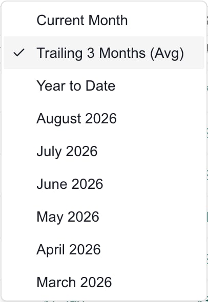
Open Period and pick a month, Trailing 3 Months (Avg), Year to Date or Current Month. See the table below.
The Period menu. The named months move forward with the calendar.
4
Narrow the rows
Use the Company search, Company type, the Grade filter or the number ranges on the column headers.
5
Learn the abbreviations
Click Glossary for metric definitions. Hover a column heading or a grade for its explanation and score breakdown.
6
Open the evidence
Click a linked revenue, support hours or endpoint value to see the records behind it. Check the period, provider, totals and records before you act on a discrepancy. Close the detail to return to the table.
A dash or an ordinary zero may have no link. Seat-profile endpoints can open even at zero, to show what setup is missing.
The monthly average of the three most recent complete months. This is the default.
Year to Date
The monthly average from January through the current month. It is not the year-to-date total.
A named month
One of the six previous months.
Revenue and support hours are monthly values for multi-month periods. A detail can show both Period Total and Monthly Average, so compare like with like. Endpoint counts are not a sum of every device or user seen across the months.
Other recurring revenue, such as separately classified recurring subscriptions.
NRR
Non-recurring revenue, such as project or one-time work.
Support Hours
Hours worked on tickets in the support boards, queues or teams you chose in settings.
Endpoints
Devices, users or both, following your reporting model. The column selector adds raw Endpoints and Users columns.
RHEM
Reactive hours per endpoint per month.
EHR
Managed revenue divided by support hours. It needs at least one support hour per month.
AISP
Managed revenue per endpoint. With a complete seat-profile model it is allocated monthly revenue per pricing seat.
The cards above the table use totals for the whole company scope and period. They do not average the visible rows, and the grade and number filters do not change them.
The grade combines three scores. Each score is 100, 80, 60, 40 or 20.
Metric
Weight
100
80
60
40
20
RHEM
33%
under 0.33
under 0.50
under 0.75
under 1.0
1.0 or more
EHR
34%
200 or more
150 or more
100 or more
75 or more
under 75
AISP
33%
200 or more
150 or more
100 or more
75 or more
under 75
EHR and AISP amounts are in your tenant currency. When you set a Target Seat Price, AISP scores 100 at or above the target, then 80, 60 and 40 at 90%, 80% and 70% of it, and 20 below that.
Grade
Score
A
80 to 100
B
60 to 79
C
40 to 59
D
20 to 39
F
under 20
A missing metric scores a neutral 60. The grade compares three revenue and support measures. It does not include every cost, so it is not net profit.A dash means the metric is not available. EHR stays blank below one support hour per month.Needs setup means the company’s seat-profile model is incomplete, so grading is held back. Open the endpoint detail to see pricing seats, support endpoints, allocated revenue, targets, conflicts and gaps. Missing license seats, missing targets, revenue allocated to profiles without seats and unmapped managed revenue can all block grading.Pricing seats and support endpoints can differ. An email-only profile can count for pricing and be left out of support endpoints. A person who matches several profiles counts in the earlier profile.Financial grades feed the Financial dimension of Client Health.
On MSP Tools > Financial Reporting, click the Revenue Trends tab and check the company scope.
2
Choose the window
Open Complete month window and pick the last 3, 6, 12 or 24 complete months. The current month is left out.
3
Choose the comparison
Open Trend comparison and pick Previous 2 months or Rolling 90-day average.
4
Choose how to group and draw it
Open Group by and pick Classification, Line type, Subtype or Item. Under Chart style, pick Bars or Lines.
5
Read the results
Read Total Revenue, the completed month change, Top Group and Peak Month. Then compare the Monthly breakdown table under the chart.
Click a legend item to hide or show a series in the chart. This does not reclassify revenue or remove it from the table.Previous 2 months compares the latest complete month with the one before it. Rolling 90-day average compares the average of the latest three complete months with the three before them. It uses calendar months, not a daily window. A change may show Not enough completed history when there are too few months or the earlier period is zero.Revenue Trends shows monthly revenue history. By Company shows monthly-average metrics for the period you picked. A trend total for a window does not equal one company’s monthly-average MRR.
Ask an administrator to check your read permission and that the Client Health feature is on.
The page says No financial data available
Connect ConnectWise, Autotask or Halo, set your revenue categories in settings, and wait for contracts and invoices to sync.
A company shows Needs setup
Open its endpoint detail and fix the seat-profile gaps in Financial Reporting settings. Allow time for recalculation.
EHR shows a dash although revenue exists
The company has less than one support hour per month. Check support hours and the support boards in settings.
Numbers differ from your PSA
Compare company mapping, period totals against monthly averages, revenue category rules, billing cadence and sync freshness. Open the linked values to see the records.
Revenue Trends omits this month
It uses complete months only. Use By Company and Current Month for the month in progress.
A settings change has not shown up
Saving starts a background recalculation. Wait a few minutes. Client Health updates on its own refresh.